Discover Responsive Weather Widget for Any Screen Size
Are you looking for a responsive weather widget for any screen size? It seems a difficult task, but we’ve got you covered! With so many options out there, finding one that actually looks good on every device can feel overwhelming. This guide will help you choose and use the right one. Discover now!
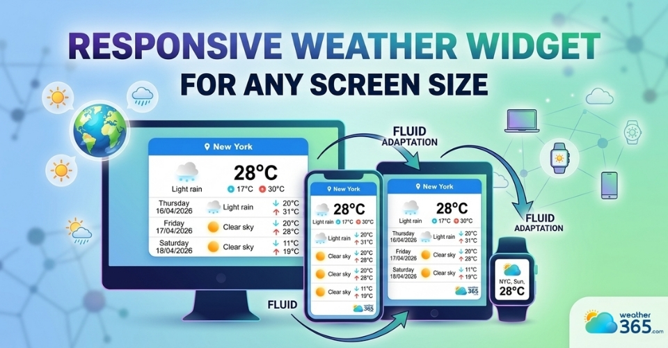
Responsive weather widget for any screen size
What Is a Responsive Weather Widget?
A responsive weather widget is a small weather display tool that automatically adjusts its layout and size based on the screen it’s viewed on.
Whether someone visits your site on a desktop, tablet, or smartphone, the widget will resize, rearrange, and stay readable without breaking your design.
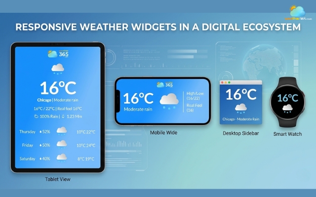
Responsive weather widgets in a digital ecosystem
Responsive vs fixed weather widget
This is what makes it different from a “fixed size” widget.
A fixed widget has a set width and height, so it may look fine on desktop but become too large, too small, or even cut off on mobile screens.
In contrast, a responsive weather widget uses flexible dimensions and adaptive layouts to fit any screen smoothly.
This flexibility plays an important role in mobile-first design.
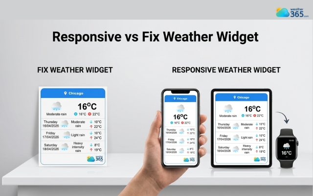
Difference between responsive and fixed weather widget
Today, most users browse websites on their phones, so your content, including widgets needs to work perfectly on smaller screens first, then scale up for larger devices.
A responsive widget helps ensure your site feels consistent and easy to use everywhere.
Google also favors responsive elements for a reason.
They improve user experience by making content accessible and visually stable across devices.
This directly impacts important metrics like Core Web Vitals, especially layout stability (CLS) and loading performance (LCP).
In simple terms, a responsive weather widget doesn’t just look better; it can also support your SEO by keeping users engaged and reducing frustration.
Key Features of a Responsive Weather Widget
A high-quality one should do more than just “fit the screen”, it should adapt smoothly and keep the experience consistent on every device.
Here are the key features to look for:
Auto-adjust layout across devices
A responsive weather widget should automatically rearrange its layout depending on whether it’s viewed on desktop, tablet, or mobile.
Elements like temperature, icons, and forecasts should stay clear and well-organized without overlapping or breaking the design.
Flexible width and height
Instead of using fixed pixel sizes, a good widget relies on flexible units like percentages (%), viewport width (vw), or height (vh).
This allows it to scale naturally within different containers, making it easier to integrate into any website layout.
If you want to understand what really makes a widget flexible and effective, take a look at our guide on weather widget features.
Touch-friendly interface
Since a large portion of users are on mobile, the widget should be easy to interact with using touch.
Buttons, tabs, or location selectors need to be large enough and spaced properly to avoid accidental clicks.
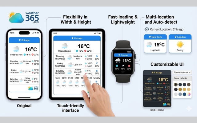
Numerous features of a responsive weather widget
Fast loading and lightweight script
Speed matters. A responsive weather widget should use optimized code that loads quickly without slowing down your website.
Lightweight scripts help improve performance and keep users from leaving due to delays.
Customizable UI (colors, fonts, themes)
Design flexibility is another important feature.
You should be able to adjust colors, fonts, and overall style so the widget matches your website’s branding instead of looking out of place.
Multi-location and auto-detect location
Advanced widgets allow you to display weather for multiple locations or automatically detect the user’s location.
This adds convenience and makes the content more relevant to each visitor.
For a better user experience, a multi-location & auto-detect weather widget can automatically detect user locations and display accurate local weather without extra configuration.
Top Responsive Weather Widget
With so many options available, choosing the right responsive weather widget can feel overwhelming.
The key is to find one that not only adapts to different screen sizes but also fits your design and loads smoothly.
Here are some of the top options worth considering:
Weather365 widget
If you’re looking for a well-balanced solution, the Weather365 widget stands out.
It’s designed with responsiveness in mind, meaning the layout automatically adjusts across desktop, tablet, and mobile without breaking your site structure.
What makes it especially useful is its high level of customization, you can easily change colors, layout styles, and display formats to match your branding.
It also supports features like multi-location display and auto-detect location, making it a strong choice for both flexibility and user experience.
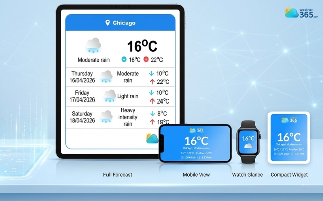
The Weather365 widget is known for its responsive feature
Elfsight
Elfsight is a popular option known for its polished design and ease of use.
It offers pre-built templates that are already optimized for different screen sizes, so you don’t have to worry much about technical setup.
It’s a good choice if you want something visually appealing and quick to install, though advanced customization may be more limited depending on your plan.
Elsight weather widget is polished and simple
WeatherWidget.io
If you prefer a simple and free solution, WeatherWidget.io is a solid pick.
It provides basic responsive functionality and allows you to generate an embed code in just a few clicks.
While it doesn’t offer as many customization options as more advanced tools, it’s lightweight, fast, and works well for minimal designs.
Each of these tools supports responsive behavior, but the best choice depends on what you need: deep customization, ease of use, or a lightweight setup.
WeatherWidget.io is simple and free
Got a responsive weather widget, but it a paid version? Don’t worry, we have a list of free weather widget for website here!
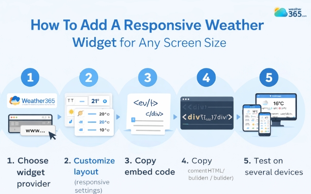
How To Add a Responsive Weather Widget for Any Screen Size
Eager to add a responsive weather widget to your site? Start now by following these steps:
Step 1: Choose widget provider
Start by selecting a weather widget tool that supports responsive design. Look for one that offers flexible layouts, customization options, and easy embedding.
For example, the Weather365 widget is often used because it’s simple and works well on all screen sizes.
Step 2: Customize layout (responsive settings)
Once you’ve chosen a provider, adjust the widget to match your website. You can usually select the location, forecast type, and design style.
Pay attention to layout settings like width or display format so the widget can adapt smoothly on mobile, tablet, and desktop.
Add a responsive weather widget for any screen size
Step 3: Copy embed code
After customizing, the tool will generate an embed code (usually HTML). This code is what you’ll use to display the widget on your website.
Step 4: Paste on website (HTML / CMS / builder)
Place the embed code into your website where you want the widget to appear.
This works for most platforms, including HTML sites, CMS platforms like WordPress, and website builders.
In most cases, it’s just a simple copy-and-paste step.
Step 5: Test on several devices
Finally, check how the widget looks across devices. Open your site on mobile, tablet, and desktop to make sure everything displays correctly.
A good responsive weather widget should adjust automatically without breaking your layout.
Sum up
Did you get a Responsive Weather Widget for Any Screen Size for your own? If not, now is a great time to try it. A responsive widget makes your website look cleaner, works smoothly on every device, and improves how users interact with your content.
Frequently Asked Questions (FAQs)
Related post

Free Weather Widget For Website: Top Ad-Free Live Weather Tools
 170
170
 0
0
 4.8
4.8
 20/04/2026

Which Weather Widget Features Matter for Modern Websites?
151
0
5.0
21/04/2026

Best Customizable Weather Widget To Add To Your Site
151
0
5.0
20/04/2026
0 Comment
Leave a comment
Your email address will not be published. Required fields are marked *